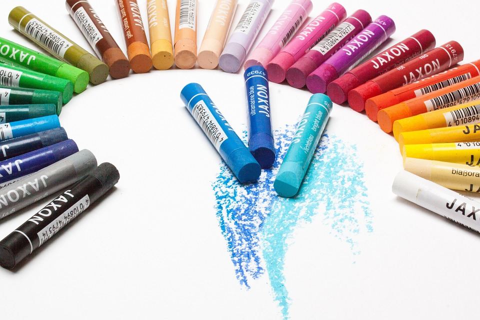
Color has always been part of our life. We’ve grown up surrounded by colors, we’ve learned color combinations basics, and we might even have a favorite color and a color we don’t like at all. So how come that knowledge is not enough for our art?
Simple.
Just as using our bodies every day doesn’t guarantee basic anatomy knowledge, using colors daily doesn’t mean we know the basics of color theory.
In this article, we’ve gathered all the information you need about color theory for artists and made it as easy to understand as possible, so keep reading and get ready to learn!
What is Color Theory
Color theory can be defined as the set of rules and guidelines that helps us understand color and its interactions with each other. It also allows artists to understand and organize colors in a well-structured system. Color theory can also be used to communicate ideas and messages and tell stories. Color theory is one of the fundamentals of art.
As with everything in the universe, there are basic scientific principles behind color. Although this article focuses on the artistic applications of color theory, knowing the science behind it is always essential.
Science Behind Color
Color is only a figment of the electromagnetic spectrum, the small portion we can perceive with our eyes.
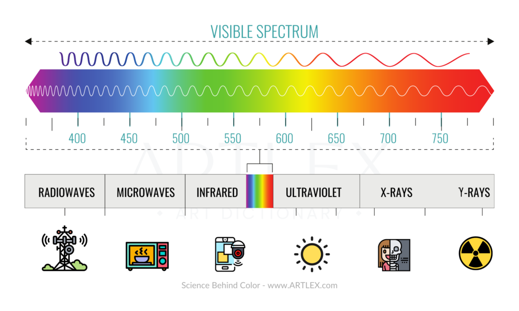
It has been proven that color is not inherent in objects. Instead, the surface of the objects reflects some colors (wavelengths) and absorbs others. The colors we see are the ones the surfaces reflect.
Our eyes and brain work together to transform light into colors. Our retina captures the light, and our brain translates the signals our eyes send into colors.
There are around ten million colors that the eye can perceive, some of them derivated from the additive light mixture and others derived from a subtractive light mixture.
Hue, Lightness, and Saturation
Hue (Chroma)
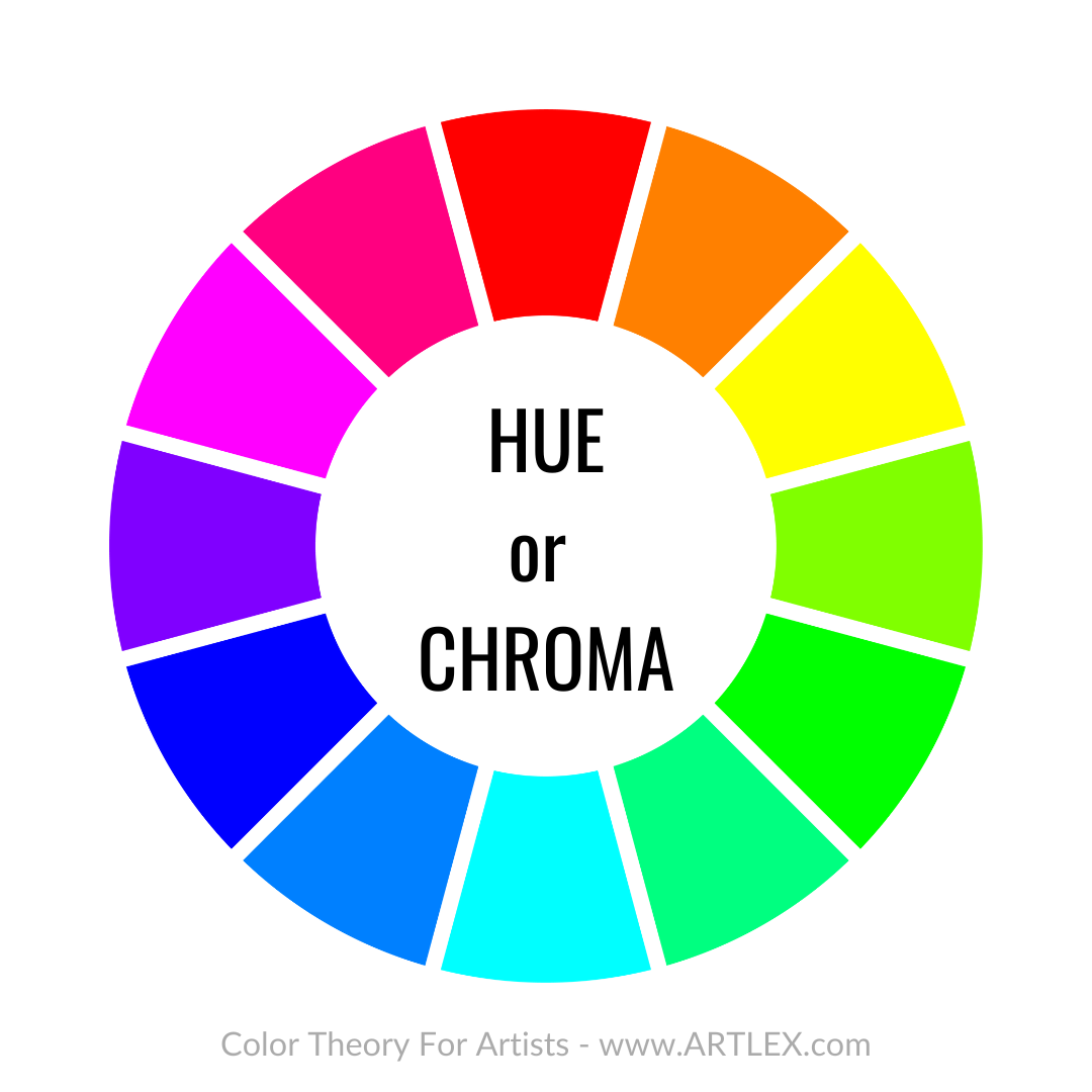
Hue is defined as the difference between each small shift in the color wheel. In traditional art, we have a set notion of hue. However, the pigments vary from brand to brand and can even be different in some countries, making universal hues virtually unachievable. In digital art, each digital painting software has a separate color slider with specific degrees of hue changes and codes for each color, making the hue easier to identify.
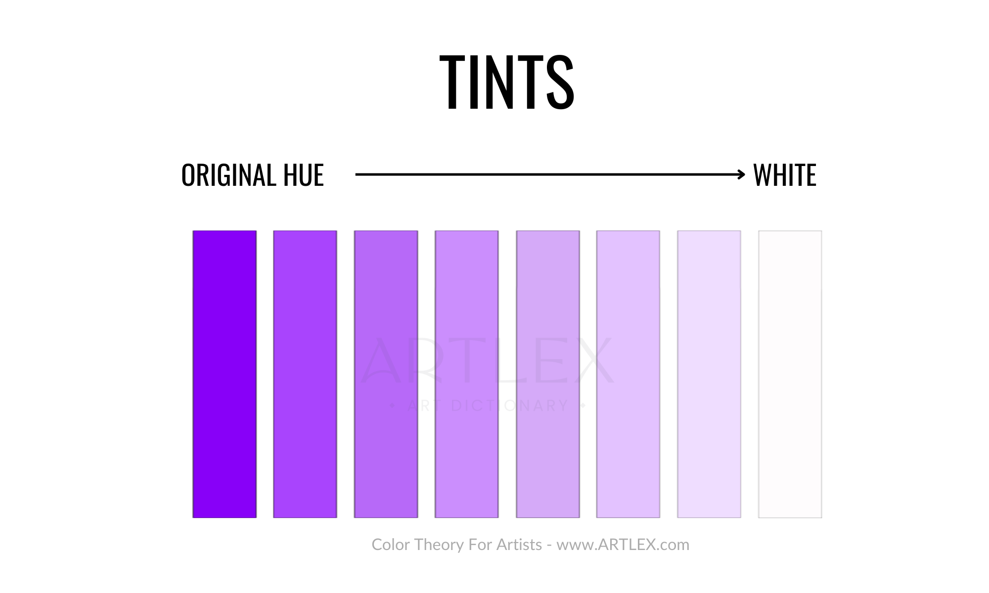
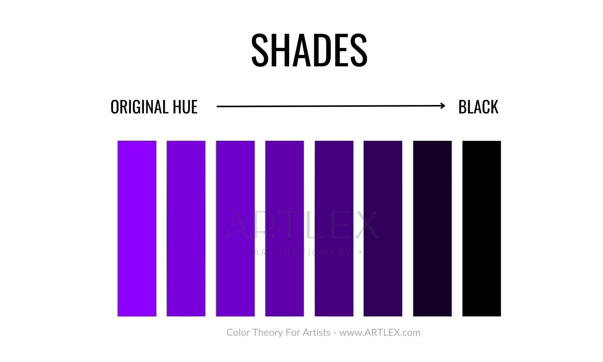
Lightness (Shade and Tint)
Hues can move around the color wheel and interact with Black and White. Lightness defines the level of interaction of determined hues with white (Tints) or black (shades).
The more white is added to a hue, the lighter the tint. For example:
The more black is added to a hue, the darker the shade gets, for example:
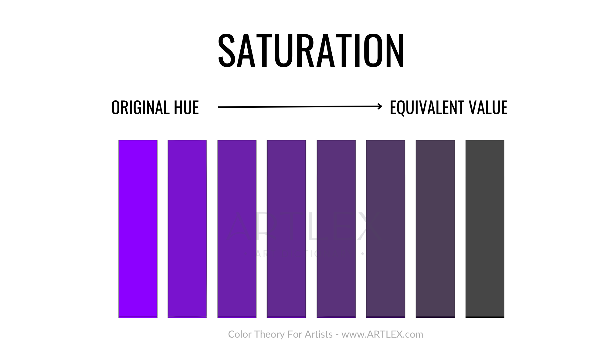
Saturation (Tone)
Saturation is the intensity of a color. If we take a color and lower its saturation without changing its value, the result would be the equivalent shade of gray.
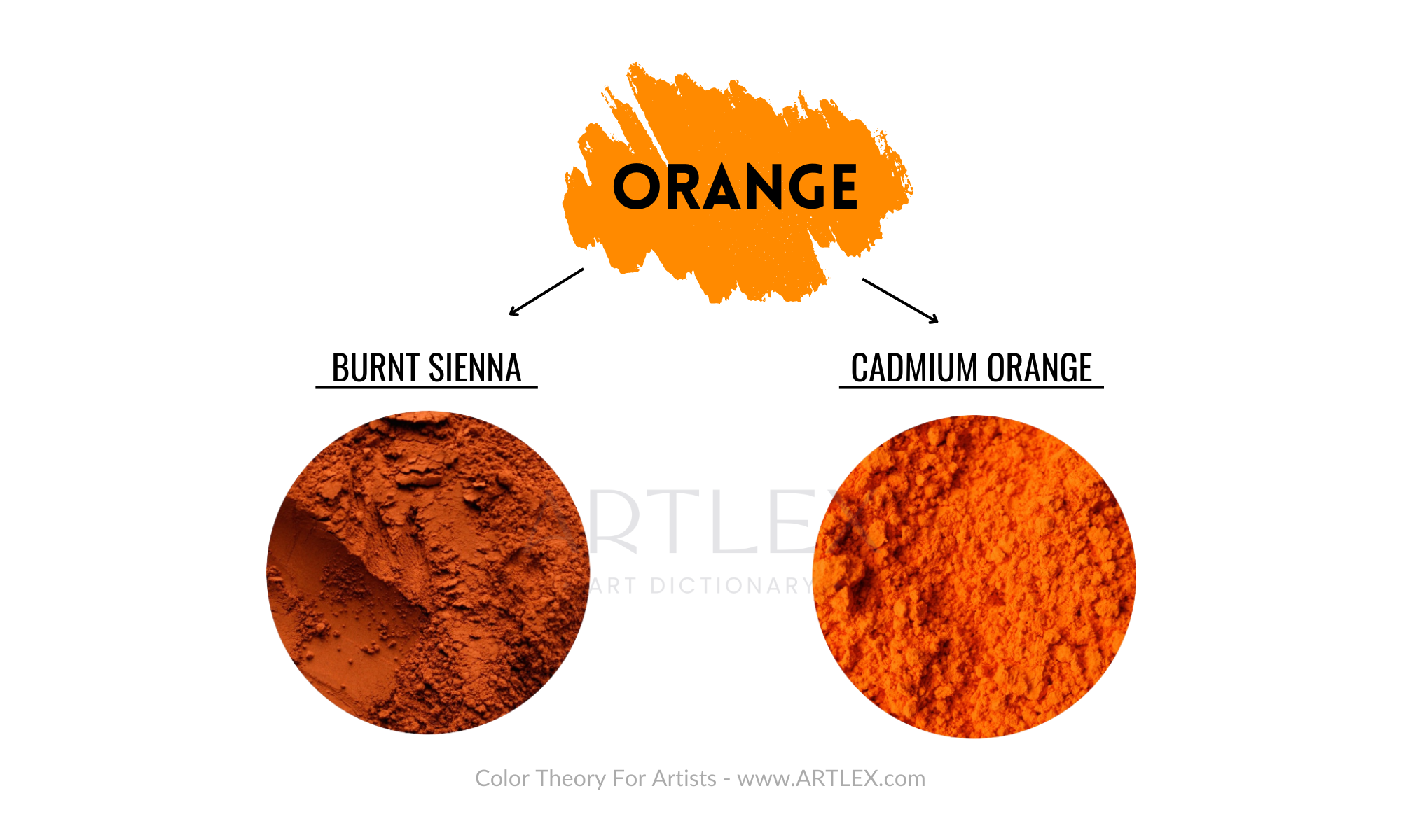
Colors, however, have different values. For example, the same hue (orange) can be used in two pigments: Cadmium Orange and Burnt Sienna.
Both of them have very different saturations but come from the same hue.
A good way of desaturating or “dulling” a pigment is to use a bit of its complementary color when mixing. The hue might change slightly, but the paint won’t appear muddy.
Additive Colors
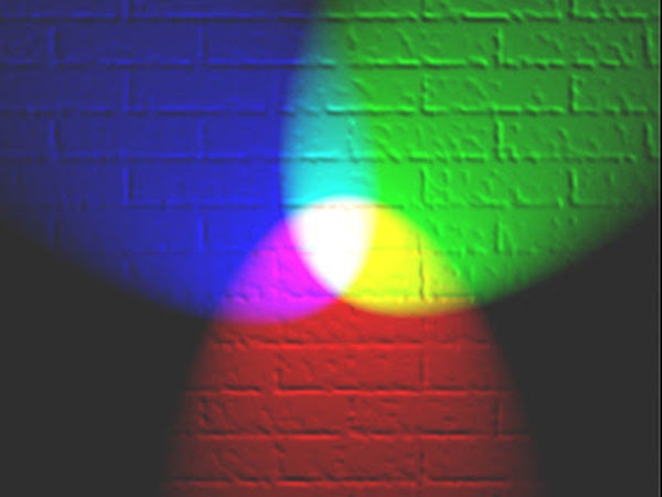
Most know that RGB was first used in photography; an additive mixture occurs when different beams of light overlap, creating new colors. For example, blue light and red light create magenta, while blue light with green light creates cyan.
This only works with colors generated by light. It won’t work with pigments and paints or in digital painting software since those rely on emulating traditional color mixing. Still, the combination allows us to see vivid images and colors on any digital device, and RGB is the model that has the widest gamut, with the brightest and more saturated colors.
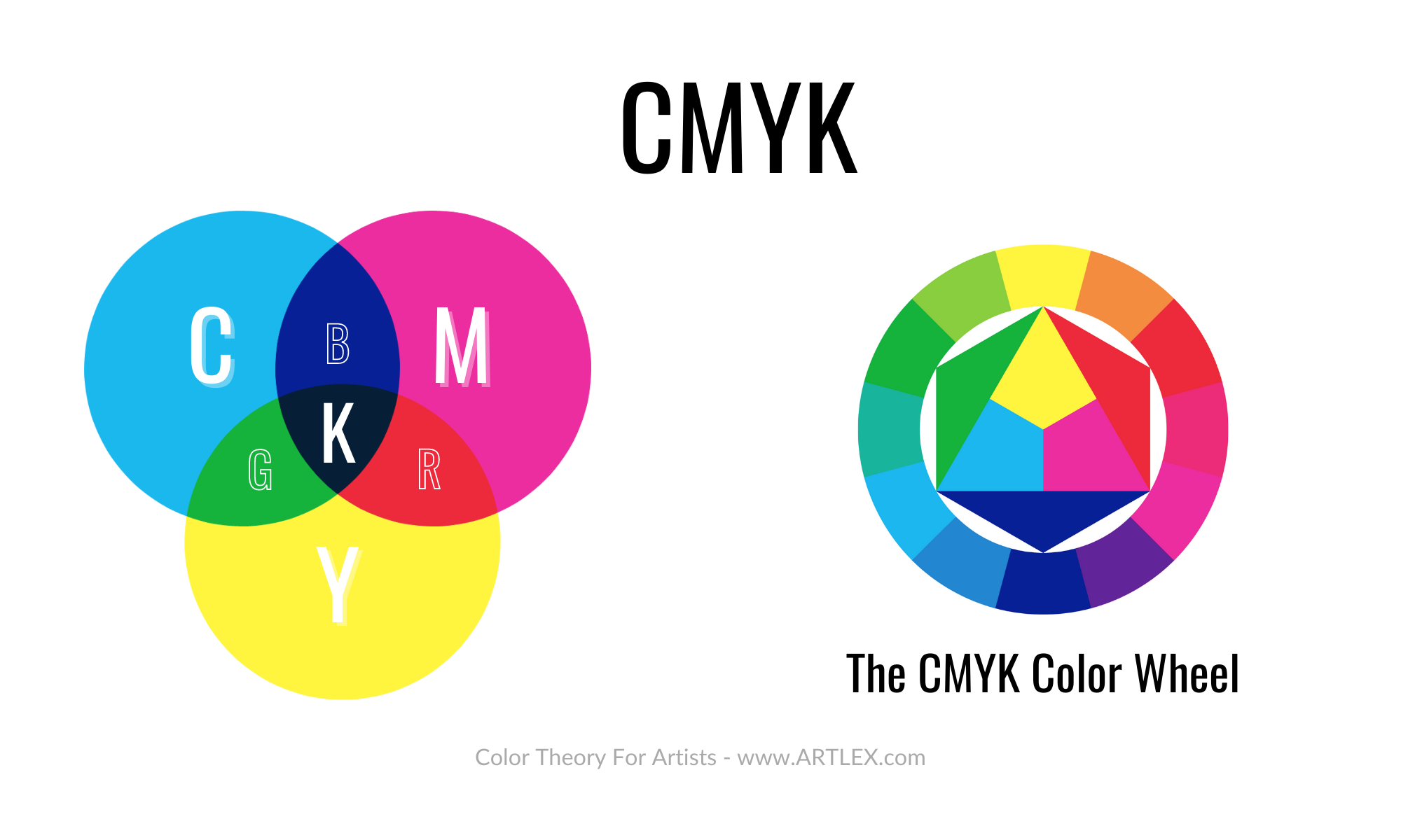
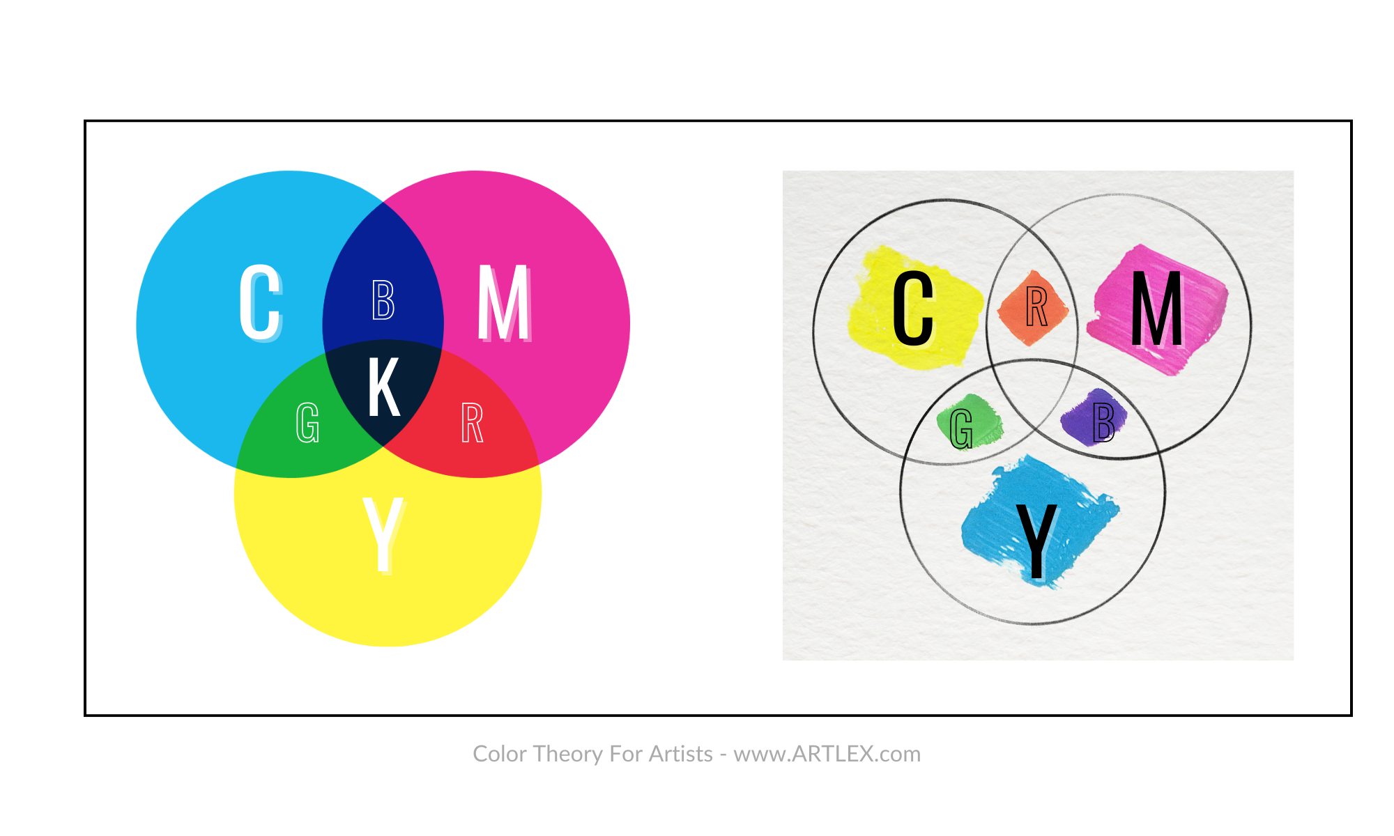
Subtractive Colors
The subtractive color model, or CMYK, was first used back in 1906 when the Eagle Printing Ink Company demonstrated that layering Cyan, Magenta, Yellow, and Black over a white substrate could create almost endless combinations of colors.
The science behind subtractive color mixing is proved when pigments are mixed, or colored filters are inserted into a single wavelength of white light. It occurs through absorption and selective transmission of light.
The color gamut might be narrower than with the additive RBG color mixing, but it allows a much more vivid and broader range of color combinations than the traditional RYB model.
The Color Wheel
Primary Colors
We’ve all learned about the colors in school, and we all share the common knowledge that the primary colors are Red, Yellow, and Blue. However, that is only partially true.
Primary colors are defined as:
“Any group of colors from which all the other colors can be obtained by mixing.” – Oxford Languages
As mentioned before, not so long ago, the primary colors were Red, Yellow, and Blue. At the beginning of the 1900s, it was proved that Blue and Red could be made from Cyan, Magenta, and Yellow combinations. Yet, Red, Blue, and Yellow couldn’t make Cyan or Magenta.
Making Cyan, Magenta, and Yellow were the “true primaries” since those pigments couldn’t be reproduced by mixing any other color. Nonetheless, they still took a very long time to be considered primary colors.
One of the reasons why the classic primary colors, Red, Yellow, and Blue, are no longer considered primary colors by many artists is because of the low amount of colors they can produce.
The RYB color model produces a low saturated, opaque, and reduced amount of combinations that make it less suitable for art.
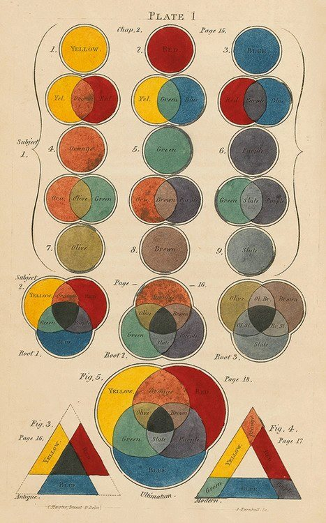
Nevertheless, this model was an excellent start and unified art education worldwide. Sadly it is still considered the primary model, causing struggles in the color-mixing skills of future artists.
Secondary Colors
A secondary color is created by mixing two primary colors. We’d have three secondary colors per color wheel based on the two main color models.
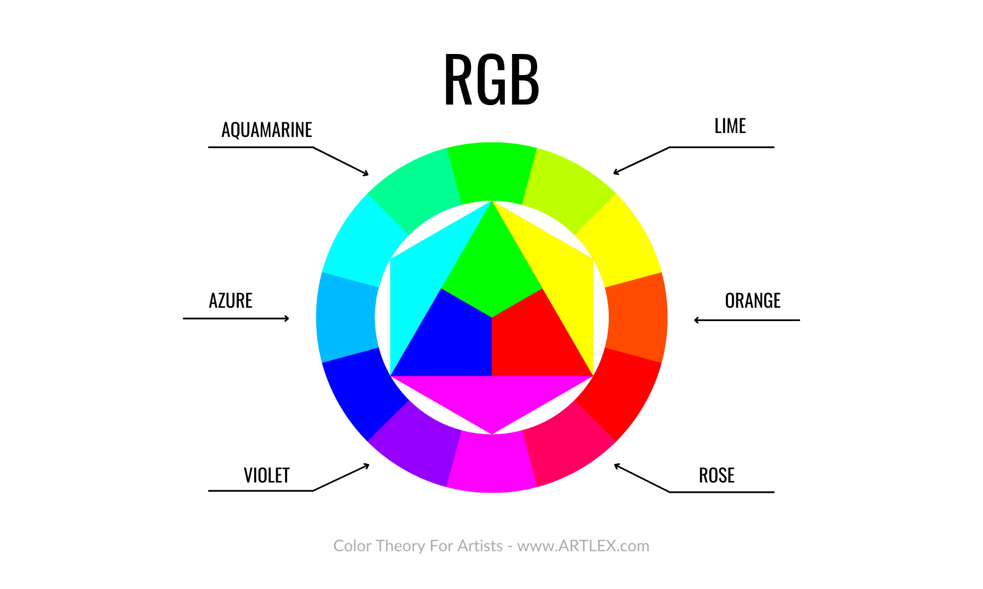
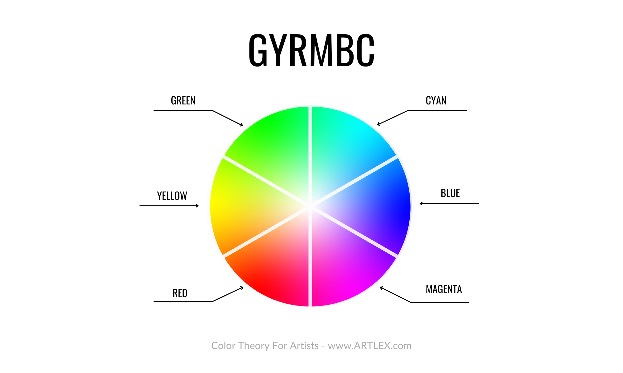
The RGB model has Cyan, Magenta, and Yellow as our secondary colors. RGB is based on mixing light so that no pigments can reproduce this color wheel.
This color model represents how our brain works and is excellent for screens and digital devices that emit light. There might be better graphics to portray the model than this graphic representation. However, this image explains it quite well.
In the CMYK model, we have Red, Blue, and Green as our secondary colors. Since the CMYK model was explicitly made for paint and pigments, here you can see both a digital and a traditional representation.
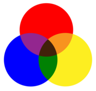
Last we have the classic RYB model. We’ve included this one to see how the theoric secondary colors Green, Purple, and Orange are far from the much more vivid colors we obtain using CMYK.
Tertiary Colors
Finally, we have the tertiary colors. Also called intermediate colors, they are a combination of primary and secondary colors.
Like the primary and secondary colours, the tertiary colors vary depending on the model.
For the additive RBG model, the tertiary colors are:
For the Subtractive CMYK model, the tertiary colors are:
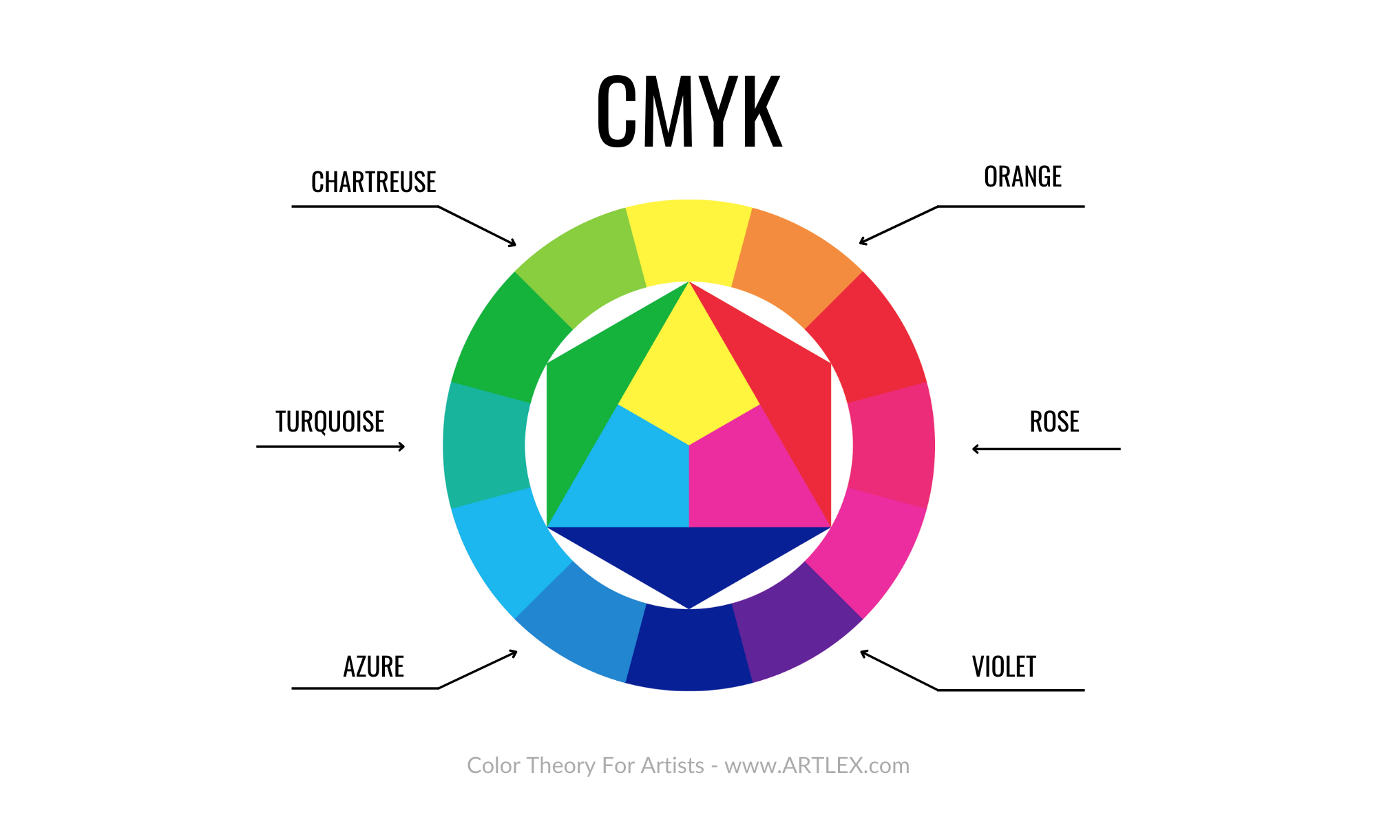
The CMYK secondary and tertiary colors are slightly darker since the pigments overlap each other, darkening the mixture.
And for the outdated RYB model, the tertiary colors are:
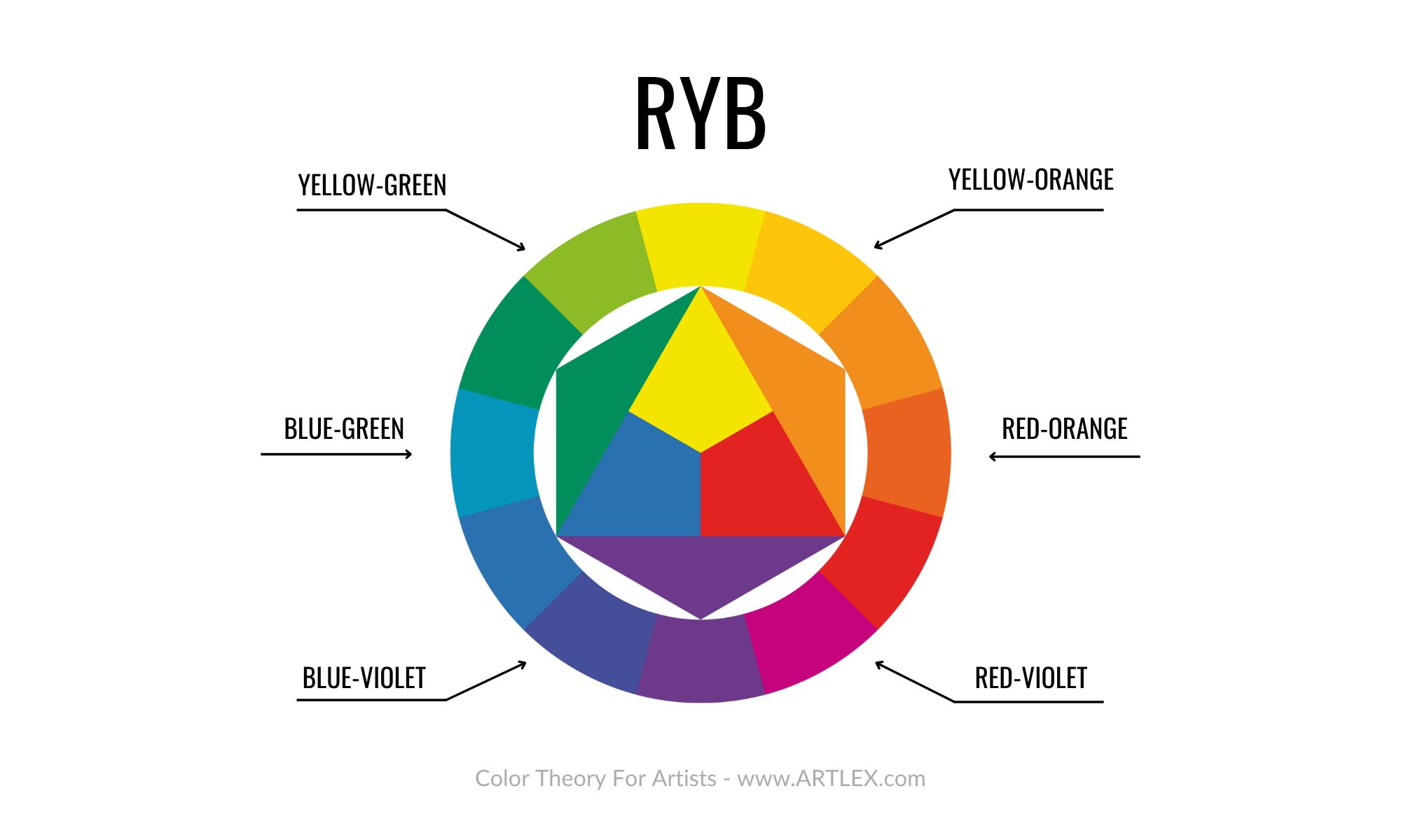
Blue-green, blue-violet, red-orange, red-violet, yellow-orange, and yellow-green. Here we can appreciate that the mentioned colors are farther away than the resulting colors of the RYB ternary mixtures.
The Ultimate Color Wheel
As we learned, CMYK is a subtractive color model, and the primary colours are CMY. The additive color model is RGB, so the ideal color palette for artists and painters would be any that includes all of those colors since they neutralize and complement each other. We can already observe this color wheel in most digital painting software since is the most versatile one and the easiest to use.
A color wheel is a way to visualize and organize colors, it doesn’t have to be perfect, but it does have to be practical and not limiting. Learning something new is always tricky. However, unlearning what we once considered correct takes even more effort and time. That’s one of the reasons why learning colour theory is critical.
Concepts constantly change with time, and although the colors will always remain the same, there will always be new things to learn about them that won’t only make us more knowledgeable in the subject but also help us improve our art.
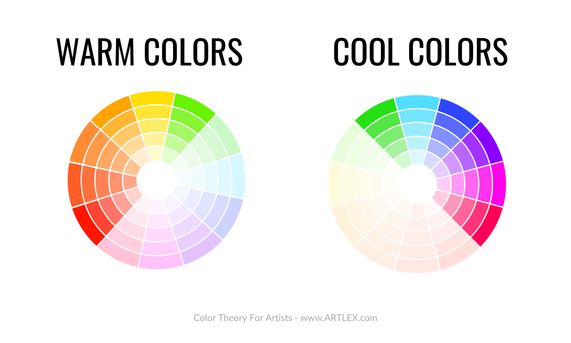
Color Temperature
We’ve all heard about warm and cool colors. Most people limit their color temperature knowledge to the position on the color wheel of a determined color. If a color is on the blue-green-purple side is cool and if it’s on the yellow-orange-red side is warm.
The reality of color temperature is a bit more complicated than that. Of course, we can group the hues of the color wheel into two significant sections that reflect opposite temperatures. Yet each hue’s tints, tones, and shades can’t be objectively placed in any of those groups since their temperature is relative to their surroundings.
For example, if we have blue and red next to each other, it is obvious which one is the “cool” and which one is the “warm” color.

However, if we have different shades of blue or different pigments of blue next to each other, we can notice that some will lean towards warm and some cool.
The same goes for Red, Yellow, and other colors.
Warm Colors
Besides the association of warm colors with heat, coziness, and a welcoming feeling, warm colors are frequently used to portray light and brightness, catching the viewer’s eye almost immediately.
Warm colors are the ones our brain perceives. First, you can identify them by comparing them to other shades of the same color or to the background. Warm colors come “forward” to us, while cool colors are in the background or in the shadows.
Cool Colors
In contrast to warm colors, cool colors give us a sense of space, coldness, and harmony. Cool colors give the brain the illusion of distance and emptiness. Cool colors tend to “recede” and give the spotlight to warm colors. Cool and warm colors complement each other only when appropriately used and work best for skies, backgrounds, and shadows.
Color Bias
When painting digitally, we can quickly identify the primaries in their purest states.
However, when using actual paint (and pigments), finding the “perfect blue” or the “ideal yellow” is not possible.
Identifying cool and warm colours can be confusing, considering the differences between paint regarding pigment names and brands as well.
Recognizing cool and warm shades of the infinite color combinations that exist is incredibly hard without proper training and enough practice, and mixing bright and vivid colors is even harder. However, we can easily distinguish our pigments and make wonderful color mixes when painting by their bias.
All pigments have a bias towards another color. Even the “purest” primaries have an inclination towards green or red. Sometimes it’s clearly stated in the tube, so in order to find if a pigment is cool or warm, the first step is to look at its bias.
If the tube doesn’t provide you with an answer, then you’ll have to rely on your observational skills in order to determine which side of the color wheel the color is closer to.
After that, only practice and several color studies with a limited colour palette will polish your abilities. One helpful exercise is making your own colour wheel with the pigments you use in your favorite brand. That way, you can get familiar with your paints and establish a system that improves your color-mixing abilities.
Color Schemes
Not all colors work well together. And not all artists know how to determine which color combinations to use.
Especially for beginners, picking colors that harmonize with each other without mimicking nature and exploring diverse color palettes is quite challenging. Color schemes are excellent tools that help the artist in that initial guessing stage.
Color schemes are not set in stone. You don’t have to follow them strictly; use them as a guide instead.
Colors are flexible and can be combined in any way. Some crazy combinations work wonderfully in different contexts, and the easiest color schemes can be hard to look at when misused.
Some of the most known color schemes are:
Monochromatic
As the name indicates, the monochromatic color scheme uses only one color. However, although this might sound confusing, remember that a single color has many shades, tints, and tones, and you can use them all in your art.
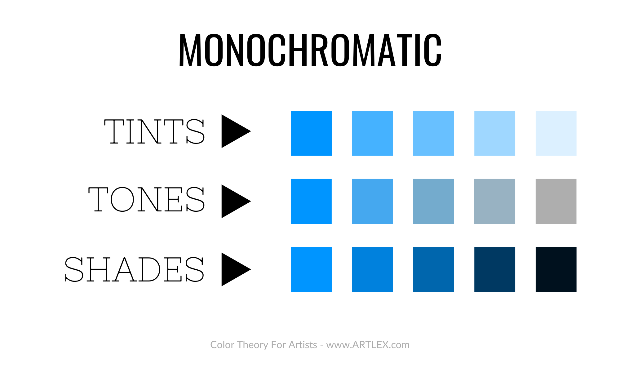
Monochromatic color schemes play with value and contrast; it is an excellent way of practicing and training the artist’s eye, but it also can be used to create impressive and elegant pieces of art.
Analogous
The analogous color scheme uses colors that are next to each other, creating a flow that is pleasant to the eye. Analogous colors work well. Nevertheless, they can blend into each other. That’s why other elements like saturation and value must be prioritized when using this color scheme.
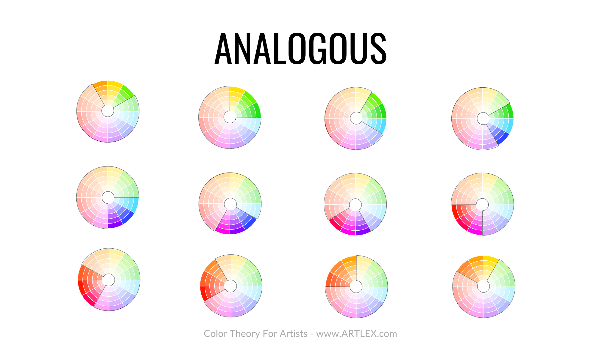
Analogous colors have a close relationship. That’s why when using this color scheme is advised to have one dominant color and use the other colours as complements.
Complementary
The complementary color scheme is one of the most popular, and not without a good reason. Complementary colors are those placed on opposite sides of the color wheel. When working with complementary colours, getting a strong contrasting effect is a given.
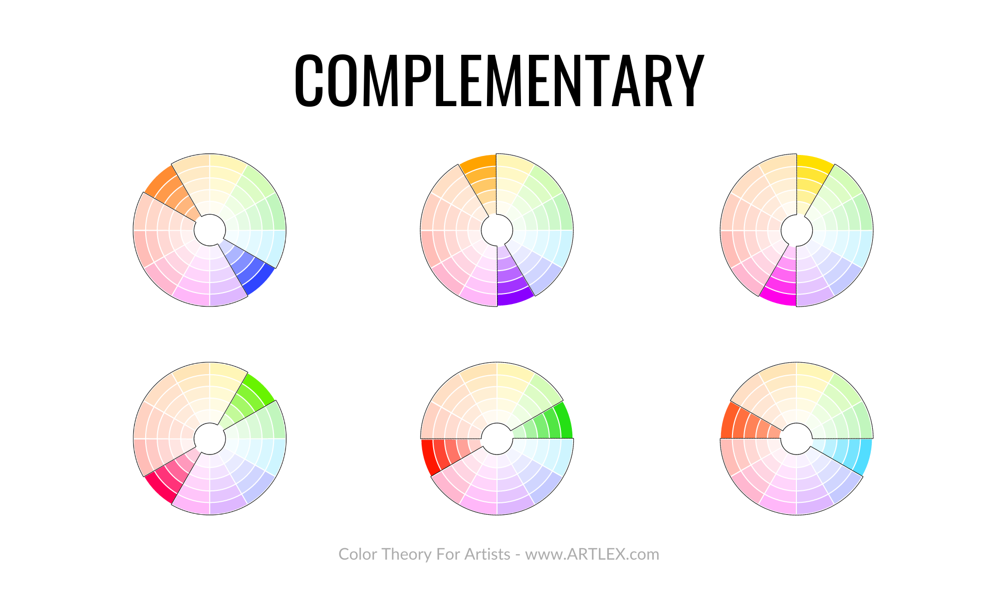
Even in different tints and values, complementary colors produce an extremely eye-catching combination. When overused, it can be overwhelming and boisterous.
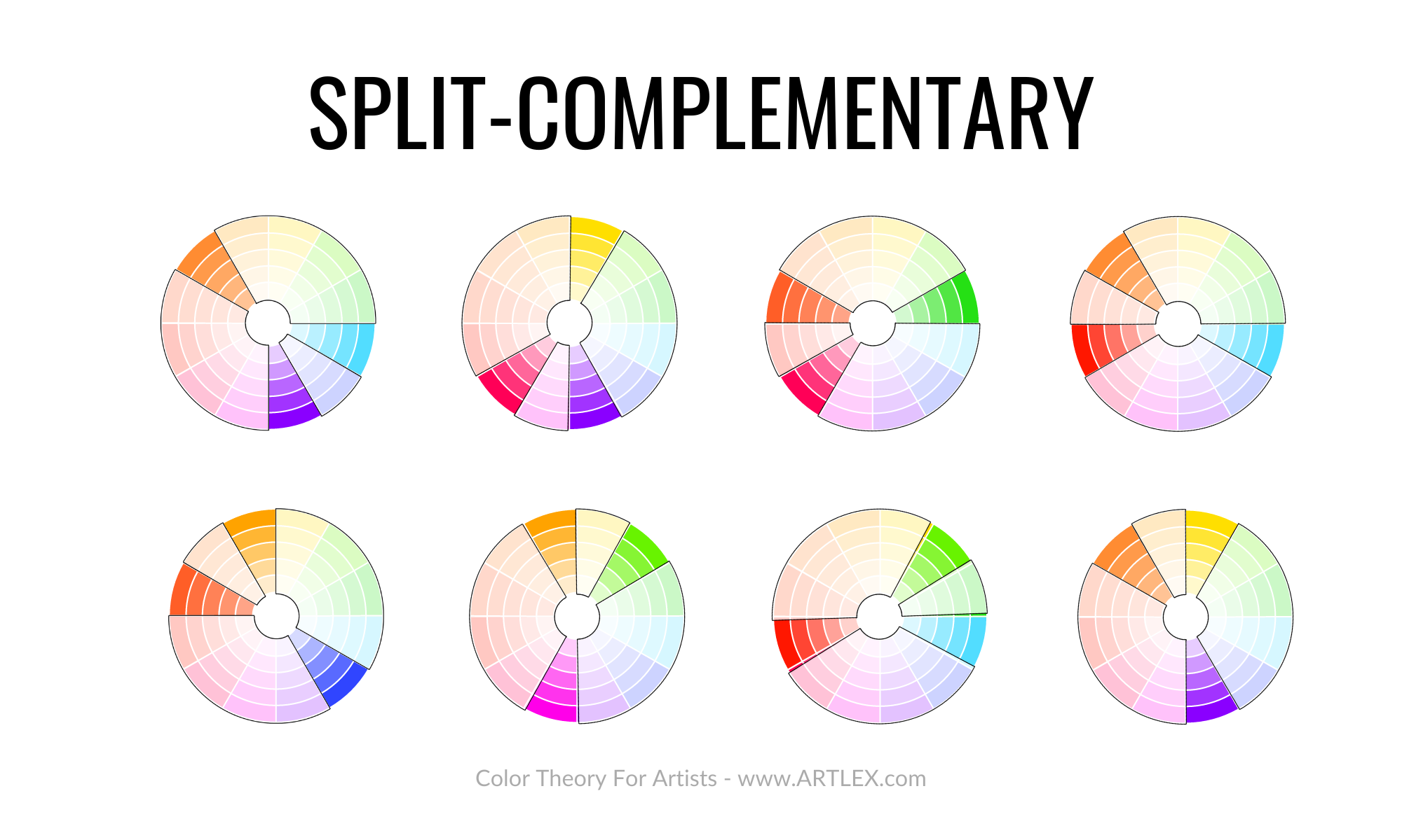
Split Complementary
This color scheme consists in taking two complementary colors, using one as the principal, and then splitting the second into two colors next to it. This color scheme is useful for a more colorful painting, but the hierarchy should be kept with one color as the protagonist and the others used for accents and adding color interest.
Triadic
The triadic color scheme uses three colors evenly split in the color wheel. This color scheme is quite popular due to the great combinations it produces. However, balancing them can get quite challenging since not all combinations work well.
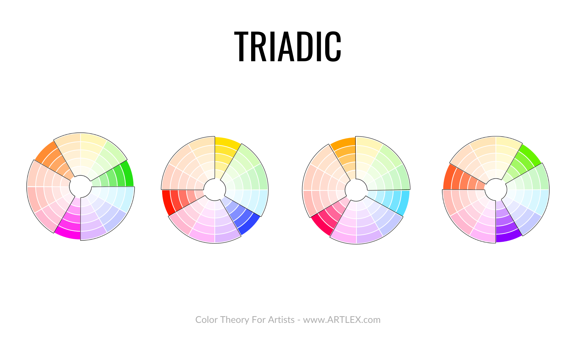
Once again, it is advised to pick a color as the main one and use it in about 60% of the painting, varying the tints, shades, and tones and using the others only as complements and accents.
Color Psychology
A color is a powerful tool that can generate strong emotions in people. It has been studied for centuries by artists and psychologists alike.
The colors we see around us influence our mood and behavior in various ways. Color psychology is the study of how colors affect human behavior, emotions, and well-being.
The tendency to associate colors with sensations and emotions has produced several studies in human behavior and color perception, giving fascinating results that can be summarized in the following list:
Blue
Blue has always been associated with calmness, tranquility, and peace. Blue is also a color that is often used in logos for businesses and organizations that want to portray themselves as trustworthy or reliable.
Blue is the most popular color in the world. Studies show that blue can help people feel more connected with their surroundings and more willing to take on tasks. It’s been shown to increase productivity, reduce stress, and lower anxiety levels.
Red
Red is the color of love and passion. It is the most intense color in the spectrum and can be found in many different shades.
In Western culture, red is associated with love, power, violence, anger, and blood. In China, red is associated with good luck and happiness.
In marketing terms, red often stands for powerful or expensive items. For example, Red cars are considered more costly than other cars because they are seen as prestigious and high-status symbols of success.
Yellow
The color yellow is the easiest on the eye and can be associated with happiness, warmth, and optimism. It is also used to attract attention and stimulate mental activity.
Yellow is a color that can affect your mood, but it’s not always a good thing. Some studies show that people exposed to too much yellow are more likely to feel angry or aggressive than those who aren’t.
Green
The color green is often associated with nature, health, and growth. It is often used in hospitals because it can help patients recover faster.
Green is the color of nature, freshness, and health. It symbolizes renewal and life. Green also denotes prosperity and good luck.
Purple
Purple is associated with creativity, magic, mystery, and spirituality in color theory. This can be seen in its association with the Catholic Church, the Eastern Orthodox Church, and Buddhism.
In some cultures, purple signifies mourning or sadness due to its connection to blood and death; in others, it represents wisdom or justice because of its ties with religious figures like Buddha or Jesus Christ.
Orange
The color orange is associated with warmth, happiness, and optimism. It is also associated with creativity and playfulness.
Orange is an eye-catching color that grabs attention when used as an accent or a contrast to other colors.
Color theory is so broad that many don’t know where to start and what to master first. We can have a basic notion from school or some Youtube video, but only some of the information is complete, and it might not be correct or apply equally to every medium.
Conclusion
We can use our eyes, try to replicate what we see, or do our best with new combinations and have nice-looking art pieces a couple of times. However, having a solid foundation in color theory can assure you of balanced and appealing art pieces that transmit a message and leave a strong impression on the audience.